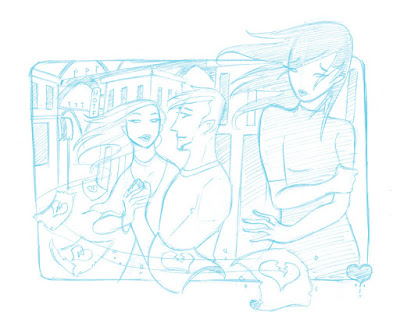
This was the original sketch. I wanted to make it a silhouette piece at first with a red and purple color scheme.
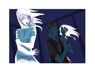
 When I started working on it today I changed my mind about making it a flat silhouette piece. So I also flipped the image as I think it works better with the girl on the left. I tried some new coloring techniques in Illustrator - well not really new, just in a way I don't usually work in.
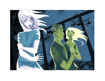
I brought the artwork over to Photoshop in layers. Normally I export pieces as EPS files and import them, but I got lazy so I just did a cut-and-paste job. I started messing with dropping textures and changing colors.

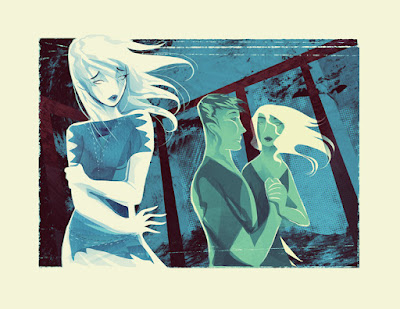
Several hours and a whole bunch of layers later, the final piece is done. I am quite happy with the more organic feel of the piece. Normally brushwork on top of my vector work doesn't really sit well, but with a simplified vector base, it seems like it's easier to work in effects in Photoshop. It would be nice to have a bit of a film stain effect too but I don't have a texture like that on hand and I'm too tired to go looking on the net or make one now.


3 comments:
It ended up quite fine. Beautiful piece!
Yea the final piece definitely conveyed the "Loss" message very well. Very nice. :)
This looks spectacular. I love how the textures are used!
Post a Comment