I've decided to finally move over to Wordpress. From now, new entries will be on the new blog, at http://blog.charlenechua.com
The new blog is pulling data from this one for older posts, so links may look funny if you search them. I am trying to tag and categorize everything (which is something that really bugged me about the Blogger blog, I couldn't tag it because I used an older template).
Please update your bookmarks and I hope you enjoy the new blog!
Saturday, April 05, 2008
Friday, March 28, 2008
Long long ago...
I was asked to submit some stuff to MOCHA (Mueseum of Childrens Art) in Oakland, CA, for consideration into their Once Upon a Time show. The show features art by childrens book illustrator, and the art they created when they were kids.
These are some of my really old drawings and paintings, done when I was 12-14. Though most of my early works make me cringe these days, I personally am still fond of the underwater dragons one, which is going to be in the show. More details later.
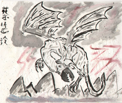
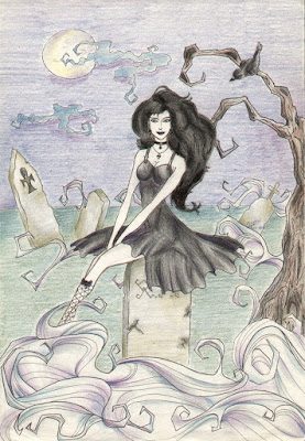
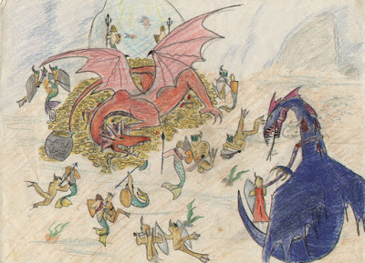
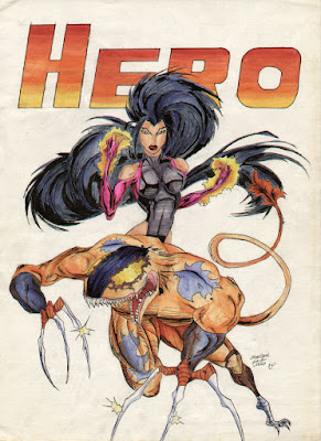
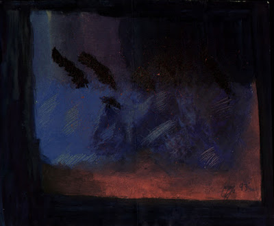
These are some of my really old drawings and paintings, done when I was 12-14. Though most of my early works make me cringe these days, I personally am still fond of the underwater dragons one, which is going to be in the show. More details later.


Sunday, March 23, 2008
Bax Bear
Keep 6 Contemporary, a contemporary/ low-brow/ pop-culture gallery a few streets down, is having an upcoming exhibition for these vinyl toys called Bax Bear. They gave me one of the 'DIY' versions of the bear to paint as I wished, to be part of the show.
So, seeing how I've never painted a toy before (unless you include the really awful paint jobs I did on model aeroplanes back when I was a kid), I decided to document the inaugural process.
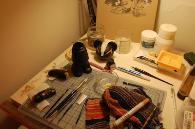
Got started at the 'other' table in the studio. Normally the light box occupies this area. But since it's basically a plastic box, I move it around sometimes so I can do other things at the table.
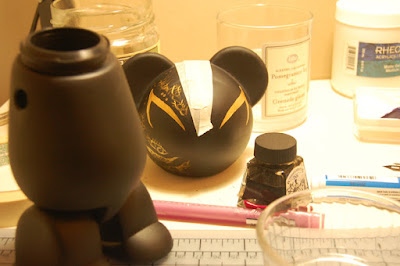
I didn't really plan out the bear. I've had a really busy last month so I wanted to do something a bit more organic. That and I didn't feel like getting stressed over designing something and then having to replicate it perfectly on said bear.
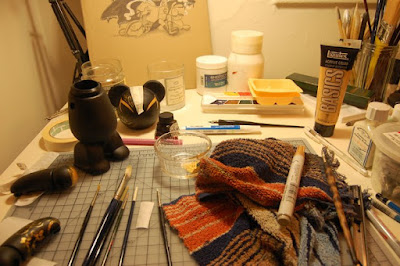
I got some gold acrylic paint and a couple of opaque acrylic markers. I didn't use the white one in the end and the gold marker tends to smudge if you rub it, so mostly I ended up working withthe paint.
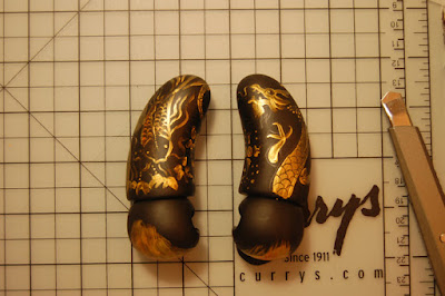
The arms look like little pieces of poop when they're on their own. I sorta tattooed them.
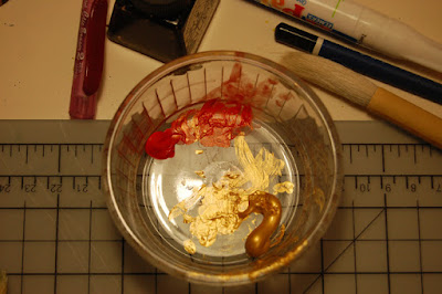
Gold acrylic and some red acrylic I mixed with the gold. You can't really see the red on the paint job, it's more of an undercoat.
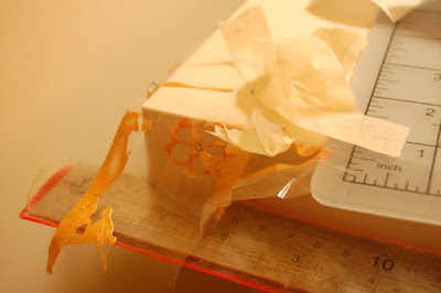
Left over stencils. I used some plastic wrap thing mostly, since it was cheaper than airbrush stencil film and it was at the shop. It's probably too tacky for illustratino board but it worked surprisingly well on vinyl.
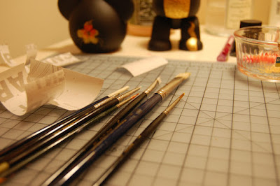
An array of small brushes used.
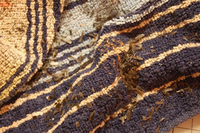
The bear was designed to pull apart for painting. Annoyingly, it wouldn't fit back together again when I was done. A call to the curator revealed that several people were also having this problem. Rafi suggested trimming the edges of the joints to make them fit. These are the little plastic shavings resulting from that. Amazingly I did not trim off the tips of my fingers in the process.
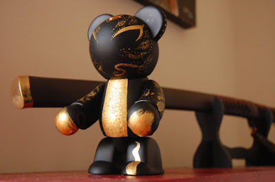
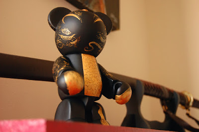
Yay. Bear's done. Coupled with a katana, and he looks pretty cool!
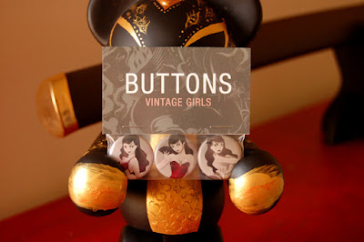
Bear-vertising. These are my buttons. Buy them - the power of the bear compels you...
So, seeing how I've never painted a toy before (unless you include the really awful paint jobs I did on model aeroplanes back when I was a kid), I decided to document the inaugural process.

Got started at the 'other' table in the studio. Normally the light box occupies this area. But since it's basically a plastic box, I move it around sometimes so I can do other things at the table.

I didn't really plan out the bear. I've had a really busy last month so I wanted to do something a bit more organic. That and I didn't feel like getting stressed over designing something and then having to replicate it perfectly on said bear.

I got some gold acrylic paint and a couple of opaque acrylic markers. I didn't use the white one in the end and the gold marker tends to smudge if you rub it, so mostly I ended up working withthe paint.

The arms look like little pieces of poop when they're on their own. I sorta tattooed them.

Gold acrylic and some red acrylic I mixed with the gold. You can't really see the red on the paint job, it's more of an undercoat.

Left over stencils. I used some plastic wrap thing mostly, since it was cheaper than airbrush stencil film and it was at the shop. It's probably too tacky for illustratino board but it worked surprisingly well on vinyl.

An array of small brushes used.

The bear was designed to pull apart for painting. Annoyingly, it wouldn't fit back together again when I was done. A call to the curator revealed that several people were also having this problem. Rafi suggested trimming the edges of the joints to make them fit. These are the little plastic shavings resulting from that. Amazingly I did not trim off the tips of my fingers in the process.


Yay. Bear's done. Coupled with a katana, and he looks pretty cool!

Bear-vertising. These are my buttons. Buy them - the power of the bear compels you...
Saturday, March 01, 2008
9Tails colored
Thursday, February 28, 2008
9 Tails
Loss - Process
I originally called this piece Cheating, since the idea was to show a girl who was upset about finding our her boyfriend was cheating on her. I prefer 'Loss' now since it's more general and describes the general theme of the picture more clearly I think. 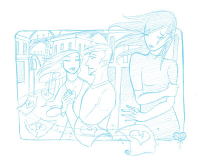
This was the original sketch. I wanted to make it a silhouette piece at first with a red and purple color scheme.
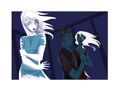 When I started working on it today I changed my mind about making it a flat silhouette piece. So I also flipped the image as I think it works better with the girl on the left. I tried some new coloring techniques in Illustrator - well not really new, just in a way I don't usually work in.
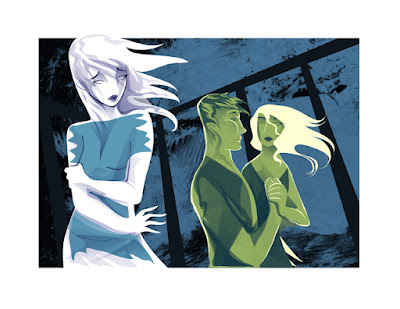
I brought the artwork over to Photoshop in layers. Normally I export pieces as EPS files and import them, but I got lazy so I just did a cut-and-paste job. I started messing with dropping textures and changing colors.
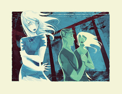
Several hours and a whole bunch of layers later, the final piece is done. I am quite happy with the more organic feel of the piece. Normally brushwork on top of my vector work doesn't really sit well, but with a simplified vector base, it seems like it's easier to work in effects in Photoshop. It would be nice to have a bit of a film stain effect too but I don't have a texture like that on hand and I'm too tired to go looking on the net or make one now.

This was the original sketch. I wanted to make it a silhouette piece at first with a red and purple color scheme.
 When I started working on it today I changed my mind about making it a flat silhouette piece. So I also flipped the image as I think it works better with the girl on the left. I tried some new coloring techniques in Illustrator - well not really new, just in a way I don't usually work in.
I brought the artwork over to Photoshop in layers. Normally I export pieces as EPS files and import them, but I got lazy so I just did a cut-and-paste job. I started messing with dropping textures and changing colors.

Several hours and a whole bunch of layers later, the final piece is done. I am quite happy with the more organic feel of the piece. Normally brushwork on top of my vector work doesn't really sit well, but with a simplified vector base, it seems like it's easier to work in effects in Photoshop. It would be nice to have a bit of a film stain effect too but I don't have a texture like that on hand and I'm too tired to go looking on the net or make one now.
Tuesday, February 26, 2008
Various tutorial work
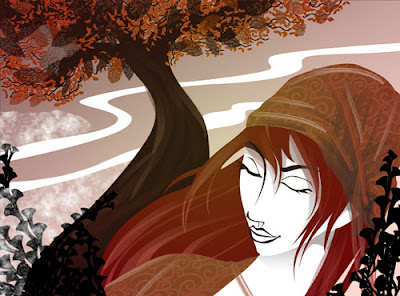
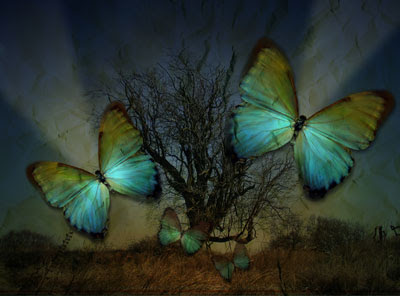
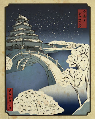
These are the final images for several tutorials I have written for Photoshop Creative and Painter magazines. They are usually tailored to the needs of the tutorials which describe different techniques and tools, and usually do not represent my usual style which is why these images have never been on my main website.
(Stock images provided by client from various sources.)
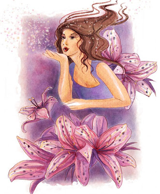
(Stock images provided by client from various sources.)
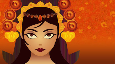
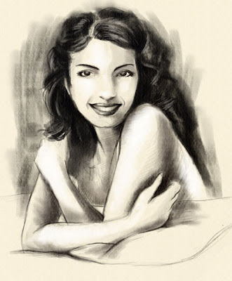
(Stock images provided by client from various sources.)
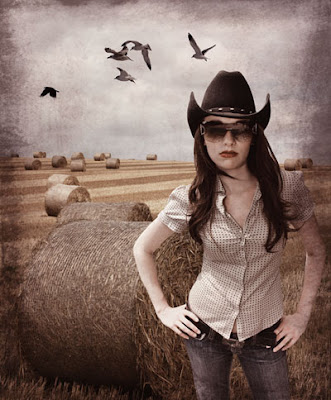
(Stock images provided by client from various sources.)
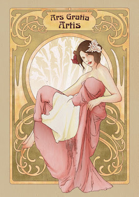
(Photo reference courtesy of Lockstock.)

(Stock images provided by client from various sources.)
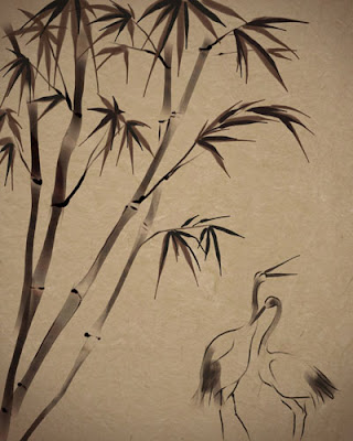


(Stock images provided by client from various sources.)


(Stock images provided by client from various sources.)


(Stock images provided by client from various sources.)

(Stock images provided by client from various sources.)

(Photo reference courtesy of Lockstock.)

(Stock images provided by client from various sources.)

Subscribe to:
Comments (Atom)


